
The New Construction Signal: Finding Opportunity Across U.S. Housing Markets
A data-driven housing market project that compares U.S. metro areas by home value growth, new construction activity, and new-home price premiums to reveal where market opportunity may be emerging.
Rezvan Heydari

When people talk about the housing market, they usually focus on one thing:
Home prices are rising.
Inventory is low.
New construction is expensive.
Certain cities are growing faster than others.
But the housing market is more complex than one headline.
A metro can have strong price growth but very little new construction. Another market can have a lot of new building activity, but slower appreciation. In some cities, newly built homes sell at a premium because buyers are willing to pay more for modern, move-in-ready homes.
That is the story behind this project.
I built this interactive dashboard to compare U.S. metro markets and better understand where housing growth, new construction activity, and new-home pricing power are showing up together.
Explore the interactive Tableau dashboard
View the GitHub project
Why I built this dashboard
In real estate, opportunity is often discussed in simple terms: “Which market is growing?” or “Where are prices going up?”
But growth alone does not tell the full story.
For realtors, investors, lenders, and builders, a stronger question is:
What kind of growth is happening — and what is driving it?
A market with rising home values may be experiencing strong demand.
A market with high new construction activity may be expanding its housing supply.
A market with a new construction premium may show that buyers are willing to pay more for new homes.
Each signal matters, but the real insight comes from looking at them together.
This project was built to make that comparison easier.
What the dashboard measures
The dashboard compares metro housing markets using four main indicators:
Median Sale Price
The typical price level in a metro market.
Home Value Growth
How much home values have increased year over year.
New Construction Share
The portion of sales activity coming from newly built homes.
New Construction Premium
The price difference between new construction homes and the broader housing market.
In simple terms, the dashboard helps answer:
Where are prices growing?
Where are builders active?
Where are buyers paying more for new homes?
Which metros may deserve deeper attention?
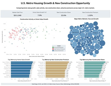
The big picture first
The top of the dashboard gives a quick snapshot of the housing market before we go deeper.
It shows four key numbers: median sale price, home value growth, new construction share, and the price difference between new homes and the overall market.
In this view, the median sale price is $311,049, which gives us a baseline for the typical home price across the selected metro markets. Home values are also up 7.0% year over year, showing that prices are still growing overall. New construction represents 22.6% of sales activity, meaning newly built homes make up a meaningful part of the market. The new construction premium is 1.32%, which means new homes are selling slightly above the broader market on average.
Together, these numbers help us understand the overall market condition before comparing individual metro areas. It is like checking the market temperature first.
Growth and construction do not always move together
This chart compares home value growth with new construction share to show what type of market each metro may be.
The main pattern is that growth and construction do not always move together. Some metros have strong price growth but lower new construction activity. That may point to demand pressure, because prices are rising while new supply is more limited. Other metros have higher new construction share but more moderate price growth. That may suggest builders are already active and the market has more new-home supply.
For investors, builders, and real estate professionals, this chart helps separate markets into different opportunity types:
High-growth, low-construction markets may deserve attention because limited supply can support stronger pricing pressure.
High-construction markets may show where development is already active and where buyers have more new-home options.
Mixed or slower-growth markets may need deeper research before making a decision.
The value of this chart is not to pick one “best” market. It helps show which metros are driven more by demand, which are driven more by new supply, and which ones may be changing.
Big metros are not always the biggest opportunity
The bubble chart gives a broader view of major U.S. metro markets by showing their size, growth, and new construction activity together.
Large markets like New York, Chicago, and Miami are important because they represent major housing activity. But this chart shows that size alone does not always mean the strongest opportunity. Some large metros may be stable but slower-growing. Some smaller or mid-size metros may show stronger growth, more active construction, or more room for future development.
For realtors, investors, and builders, this is useful because opportunity is not always in the biggest or most famous market. Sometimes the better signal comes from a metro where price growth, buyer demand, builder activity, and future supply are starting to line up. This chart helps readers look beyond market size and compare where the real momentum may be happening.
Which metros are growing fastest?
This chart ranks metro areas by home value growth and shows where appreciation is strongest.
In this view, Coeur d’Alene, ID; Knoxville, TN; Heber, UT; Boise City, ID; and Tullahoma, TN are among the fastest-growing metros. These markets show stronger price momentum compared with the other metros in the dashboard.
For realtors, this can help identify markets where sellers may have more pricing power. For investors, it can highlight metros that may deserve a closer look because home values are moving upward. For mortgage and lending professionals, it can also signal where affordability may be getting tighter as prices rise faster.
The key point is that strong growth is important, but it should not be viewed alone. That is why the dashboard also compares each market with new construction activity and new construction premiums.
Where are buyers paying more for new homes?
This chart shows which metro areas have the highest new construction price premium. In simple terms, it shows where newly built homes are selling for more than the overall housing market.
In this dashboard view, Pittsburgh, Detroit, Milwaukee, Columbus, and Albany are among the metros with the highest new construction premiums. This does not automatically mean these are the best markets. But it does show where new homes are priced higher compared with the broader market.
That premium may come from buyer preference for newer homes, modern layouts, builder warranties, or limited new-home supply. For builders, investors, and real estate professionals, this is a useful signal because it shows where new construction may have stronger pricing power and may deserve a closer look.
Where is new construction becoming a bigger part of the market?
This chart shows which metro areas have the highest new construction share. In simple terms, it shows where newly built homes make up a larger portion of total sales activity.
In this dashboard view, Spartanburg, Raleigh, Boise City, Myrtle Beach, and Lakeland stand out with the highest new construction share. This means new homes are playing a bigger role in these markets compared with many other metros.
For builders, this may point to areas where development is already active. For realtors, it can show where buyers may have more new-home options. For investors and lenders, it can help identify markets where housing supply is expanding.
The main question this chart helps answer is: Where is the housing market physically growing?
That question is valuable for builders, investors, lenders, and real estate professionals who want to understand where future housing supply is being added.
The main insight
The main takeaway from this project is that housing opportunity cannot be judged by one number.
A market may have strong price growth, but that does not always mean it is the best opportunity. A market may have a lot of new construction, but that does not always mean demand is strong. And a market may have a high new construction premium, but that does not automatically make it a better market.
The better story appears when these signals are viewed together.
If prices are rising but new construction is limited, the market may be facing supply pressure. If new construction share is high and home values are still growing, the market may be in an active growth phase. If new homes are selling at a premium, buyers may be showing stronger demand for new homes or facing limited new-home supply.
If construction is high but price growth is slowing, the market may need closer review. That is why this dashboard focuses on patterns, not just rankings. It helps show where growth, supply, demand, and pricing power are moving together — and where the story may need a deeper look.
Why this matters
For realtors, this dashboard can turn market data into a simple story for clients. Instead of only saying a city is growing, they can explain whether growth is coming from price appreciation, new construction activity, or buyer demand for new homes.
For investors, it can be a starting point for comparing metros before doing deeper local research.
For builders and developers, it can highlight where construction activity is already strong and where new-home pricing power may exist.
For mortgage and lending professionals, it can connect housing trends with buyer demand, affordability, and market risk.
The dashboard is not designed to replace local expertise. It is designed to support better questions and smarter decisions.
Tools and process
This project was built through a data analytics workflow:
Python was used to clean and prepare the data.
Pandas was used to organize, transform, and calculate market indicators.
Tableau was used to design the interactive dashboard.
GitHub was used to document and share the project.
The final dashboard was published on Tableau Public so users can explore the market visually and interactively.
Final takeaway
Every metro housing market has its own story.
Some markets are growing through appreciation.
Some are expanding through new construction.
Some show stronger buyer demand for new homes.
Some may be shifting into a slower or more transitional phase.
By combining home value growth, sales activity, new construction share, and new construction premium, this dashboard helps make those stories easier to see.
The best real estate opportunities are not found by looking at one number. They appear when growth, supply, demand, and pricing power are viewed together.
Explore More...
Housing Affordability Indicators
Behind housing affordability is a larger economic story. By looking at mortgage rates, inflation, wage growth, and housing trends together, this project shows how pressure can build slowly before it becomes clearly visible.
A Systematic Approach to Growing a Real Estate Portfolio
Growth in real estate is not just about buying more properties. The strongest portfolios are built through disciplined, repeatable decisions that create clarity, resilience, and long-term value.
Bringing together business strategy, real estate insight, and mortgage perspective through data-driven thinking.
Phone
hello@rezvanheydari.com
+1-404-798-4404
© 2025 Rezvan Heydari. All rights reserved.
Based in: Atlanta, Georgia, USA
Quick Links
Stay Connected
LinkedIn
Tableau Public
GitHub
Newsletter
Kasebin Business Hub